

Assuming that Serena Williams was on course to win the US Open on September 12, 2015–her 22nd major title and fifth in a row–I decided in advance to create as big a data experience as possible about her. So, I sent a message (included below) to Jeff Sackmann, founder of the tennis analytics database Tennis Abstract, to get some help gathering the necessary data.
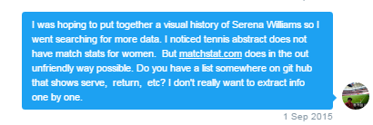
I definitely couldn’t rely on the Women’s Tennis Association (WTA) website. Its statistics–which only cover the bare minimum of indicators, for only the top 10 ranked players, and not even to the level of individual match data–are locked in PDFs. At first, Sackmann didn’t have any of Serena’s statistics either, but he emailed me the next day with enough to cover 506 of her matches. It wasn’t everything–much of her early career data seems long gone–but together with detailed statistics from a crowdsourced tennis data collection initiative called The Match Charting Project (MCP), which Sackmann also founded, there was finally enough to tell a good part of her story.
With the incredible amount of technology available for gathering data from tennis matches these days, you’d think it would be at the forefront of sports analytics. Sadly, this is not the case. Most data is kept under lock and key, and selectively presented in a watered-down format to enhance the “fan experience” for spectators at home. According to Stephanie Kolvachik, a researcher for Tennis Australia’s Game Insight Group, “the ‘siloing’ of data is a problem all sports are facing.” She noted also that with the success of data science comes more opportunities for commercialization and, therefore, a closed-door policy on collected data for those unwilling to pay the entrance fee.
Charles Allen–creator of the analytics site Tennis Visuals and advocate for open data–found this out for himself. He’s the father of two boys immersed in the world of European youth tennis tournaments. It’s a place where data should support player development, but it rarely makes an appearance. To help his kids, Allen charted his sons’ matches via the ProTracker Tennis app, but he couldn’t share the results conveniently. He used this as an opportunity to learn how to visualize interactive data.
He told me that some of the top coaches he knows–with all this technology at their disposal–never use it, because they don’t have the time or support systems to acquire and deconstruct the data. “I’d like to see the barriers to technology use lowered, to see the ease of use and accessibility improve,” he said. As innovation and technology accelerate, most companies choose to create “closed ecosystems,” but Allen believes there are “passionate individuals who “‘get it’ and will make a dent one way or another.”

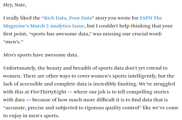
“Men’s sports have awesome data.” Allison McCann, a visual journalist for FiveThirtyEight, substantiates this important distinction in her response to an article by Nate Silver about how “sports has awesome data.” While the now-infamous story of Billy Beane and his use of sabermetrics (the subject of the book and movie Moneyball) introduced the world to sports analytics, there are a few other stories that need attention. For those who are now invested in the rising influx of quantitative sports stories: How many of them were on men’s sports? How many do you remember about the women playing the same sport?
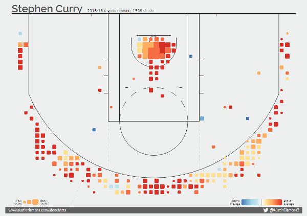
Sue Bird’s The Players’ Tribune piece, “Analyze This,” tackles this disparity between the WNBA and NBA. Consider Stephen Curry and the Golden State Warriors. We know every single detail about them. Now, did you know that the Chicago Sky’s Elena Delle Donne made 95 percent of her free throws this season?
WAIT. WHAT!? (I know–I only looked her up because Bird’s article mentions her.) Here we have a woman basketball player shooting better from the line than most of the NBA and WNBA throughout all of history, and I had no idea.
If I were to compare the NBA and WNBA stats websites, the difference is glaring–and even though there are resources that seem far better, Bird still highlights this notion of “supply and demand.”
While we can urge the WNBA and other sports to invest in data, we’ll see this demand met only when more people actually want to see the data.
So I have to ask: Are people just not interested? And why not?

With great data comes great responsibility. There is often a hesitation when it comes to data in sports, as many people believe statistics dehumanize them. However, John Burn-Murdoch, a data journalist for the Financial Times, clarifies that quantitative sports journalists absolutely hate the insertion of statistics without meaning. Essentially, they know how to use data well.
“Statistics in sports journalism are seamlessly intertwined with narrative to find or enhance key points. They’re used creatively to present familiar stories in new light. They’re used to uncover and crystallize disparate and complex stories,” he said.
For Kolvachik, statistics are vital for challenging misconceptions about women’s sports–from the illusion of inconsistency between men and women players, to many other popular myths and biases. It’s possible to draw inspiration from known examples of sports analytics, like in baseball, and find use in others, like tennis.
For McCann, stories like the best WNBA teams not needing a three-point game plan are the most interesting, because–while counterintuitive–coaches can explain their strategies in terms of the different strengths of their players instead.
I asked McCann what story she would tell if she had all the data resources in the world. She said she wished every women’s soccer game had Opta tracking, because the biggest difficulty in writing a comprehensive data story is the small sample size in women’s soccer. Opta tracking helped illustrate the U.S. women’s national team’s long ball problem and the failed Abby Wambach midfield experiment. Opta found that “when Wambach drops into the midfield to receive the ball (no matter if she’s successful or not), it causes a cascading loss of structural integrity in the U.S. system of play.”
McCann highlighted this part of the analysis for me and it is by far the most beautifully constructed sentence I have ever read.
For Alfredo Martinez Jr., soccer was the sport he grew up with, but he didn’t become interested in the women’s game until the 2011 Women’s World Cup. He heard a former player from his alma mater, Kelley O’Hara, was going to be playing, and he remembered watching her during college. He’d watched the National Women’s Soccer League (NWSL) occasionally, but last year he made a conscious effort to devote his time to one team, the Portland Thorns FC.
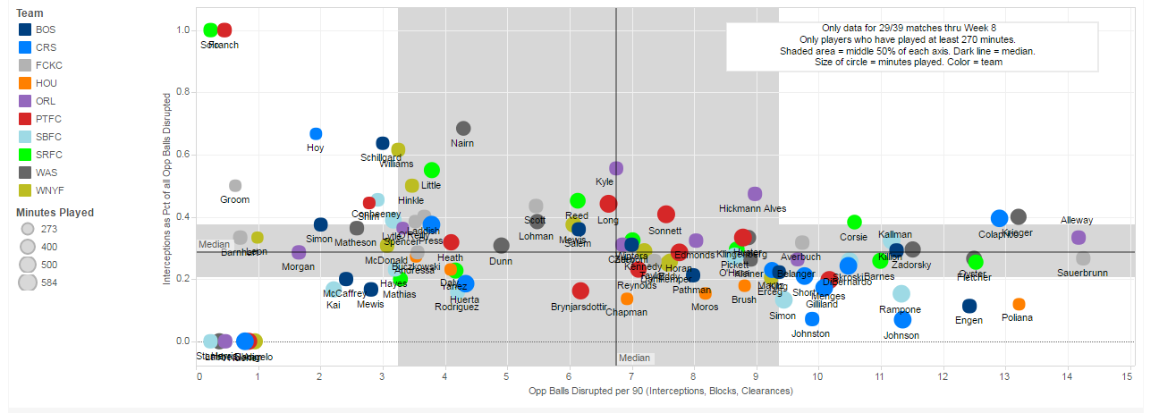
While watching, Sinead Farrelly (not the well-known Christine Sinclair, Alex Morgan, or Tobin Heath) caught his attention. He remembers watching her and thinking, “This is a player who does everything and is always there.” She doesn’t necessarily score goals on a regular basis, and if you look at the minimum publicly available NWSL stats, you’d just ignore her. And yet, she played and started almost every game for the Thorns last year. If there was data on interceptions and tackles–the little details nonexistent in the NWSL but ubiquitous in the men’s game–her importance would easily be recognized. Martinez spotted this lack of data and decided to change the situation–meanwhile proving to himself the importance of Farrelly.
As a history major in between jobs, Alfredo first had to learn about data science, but he also needed a way to practice his newfound skills. Thus, WoSo Stats was born. His motivation was clear: He wanted to tell the stories of underappreciated and lesser-known players, and illustrate how their excellence matches up to the level of World Cup champions. He gave me examples of the Chicago Red Stars’ Dani Colaprico and her excellence in defending passes; or the ability of the Washington Spirit’s Christine Nairn to split defenders with a good through ball. He remembers former national team goalkeeper Nicole Barnhart and her superiority at stopping big chances, and while he acknowledged that “part of that might be luck, at a certain point you have to wonder.”
Despite originally planning to keep his project private, he soon realized the magnitude of the task. Building a platform for detailed stats provided an avenue to visualize the brilliance of these players. Since going public in January, he has around 10 volunteers who together have tracked 74 percent of matches this season. Martinez’s goal is to have data for the entire season by the end of the year.
With the NWSL in its fourth year, he’s enjoyed watching its growth–although it would be even better if he could show you how the league and its players have grown since the very beginning. What if we could actually determine the type of player a team needs, and who would fit that role perfectly? Imagine having that kind of tool during the college draft. At this point in our conversation, Martinez and I went back and forth with our blue-sky ideas. However, before he can realize his dream, he knows the priority is data collection–there’s just so much more to do and always room for help from volunteers.
For now, we must rely on the wonderful services of Martinez, Sackmann, Allen, and countless others, who continue to take the time to bring us as many details and resources as possible so we can share our stories.

Serena did not win her 22nd major title at the US Open. She lost in the semifinals to Roberta Vinci.
In fact, it was only a few weeks ago, at Wimbledon again, that she finally won. However, her loss at the US Open did not stop me from writing my “Tennis Note #22“–an audiovisual data history of Serena Williams.
I can say with certainty, of all the data stories I have written, hers remains the most popular.
How We Get To Next was a magazine that explored the future of science, technology, and culture from 2014 to 2019. This article is part of our Playing the Field section, which examines how innovations in sports affect the wider world. Click the logo to read more.