

For the last eight years, Gallup-Healthways and Health eVillages have published an annual report about the health of U.S. cities. It’s called the Well-Being Index, and it aims to capture how people feel about and experience their daily lives.
The data is gathered through interviews, which ask people a bunch of questions, split into five categories:
- Purpose: Whether people like what they do every day and are motivated to achieve their goals.
- Social: Whether people have supportive relationships and love in their lives.
- Financial: Whether people can manage their economic lives to reduce stress and increase security.
- Community: Whether people like where they live, feel safe, and have pride in their communities.
- Physical: Whether people are physically healthy and have enough energy to get things done on a daily basis.
You can find the full details of the methodology here.
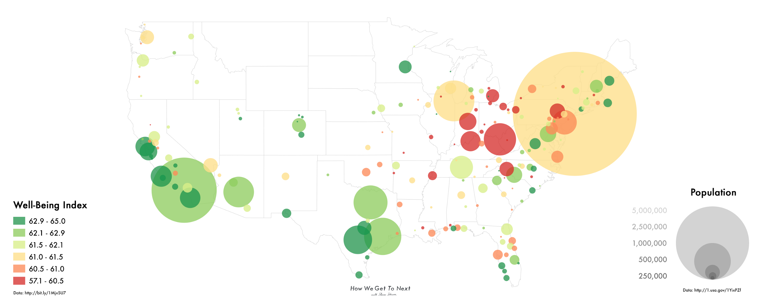
In the graphic at the top of this post (click it to make it bigger, especially on cellphones), you can see the 2015 results for 188 of the largest communities in the contiguous United States. On the map, the size of the circle represents population, while its color represents its Well-Being Index score. Indexed numbers range from 57.1 (the unhealthiest in the survey: Charleston, West Virginia) to 65.0 (the healthiest: Naples, Florida).
The index is calculated such that a difference of about 1.0 points represents a statistically significant variance in well-being between two communities, usually characterized by a large difference in one or more of the categories listed above. For the nation as a whole, the Well-Being Index score for 2015 was 61.7–essentially unchanged from the 2014 score of 61.6.
As you can see from the map, the highest-ranked communities tend to be in the south and west of the country, with a few exceptions in smaller cities. The lowest-ranked communities tend to be clustered in the Rust Belt, where economic decline and urban decay has been precipitated by the loss in manufacturing jobs.
You can see this in the following graphic, too, which depicts the various aspects Gallup studied as the features of Chernoff faces. In it, we mapped the 16 largest cities in the United States, organized in order of population. The smaller the features, the higher the rank of the feature in question–with the exception of population, which increases with face size.
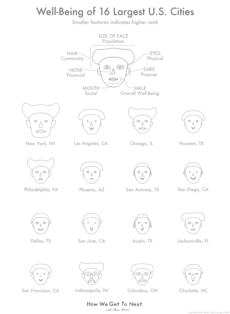
So, for example, the tiny features of the San Diego face show that it scores very highly in all categories, while the large features of Indianapolis represent that it ranks poorly across the board. Dallas has mostly small features, but large eyes–indicating that the physical environment pales in comparison to other cities.

In Gallup’s summary of the data, the research firm argues that communities have far more power than states in terms of improving the lives of their citizens. It wrote:
U.S. communities are at the front lines of American well-being. City leaders are often able to create and sustain a culture of well-being in ways that leaders of more geographically diverse states cannot. This is critical, as well-being can have a very real effect on a wide variety of outcomes for a community.
Communities with low well-being, as a whole, have residents with significantly higher obesity rates and double the heart attack incidence, thus incurring substantially higher healthcare costs. Conversely, communities with high well-being tend to have residents who learn and do interesting things daily, have safe places to exercise, have high energy levels and believe that their water is safe to drink.
As community leaders think about strategies to improve residents’ lives, they should simultaneously consider the relationship between good jobs and well-being. Good jobs in a community boost the well-being of its residents, and residents with higher well-being attract potential employers seeking a workforce that has better job performance, less absenteeism and lower healthcare utilization.
The full scores for every community, as well as their breakdown into categories, can be found in this PDF–which also looks in-depth at community access to basic health services. Does the rating for your community reflect your reality? Share your experiences by leaving us a response below.
How We Get To Next was a magazine that explored the future of science, technology, and culture from 2014 to 2019. This article is part of our Metropolis section, on the way cities influence new ideas–and how new ideas change city life. Click the logo to read more.