

This week, alongside episode 5 of “The ID Question,” we published a detailed analysis of the world’s endangered languages–a project that I’ve been working on for the last couple of months.
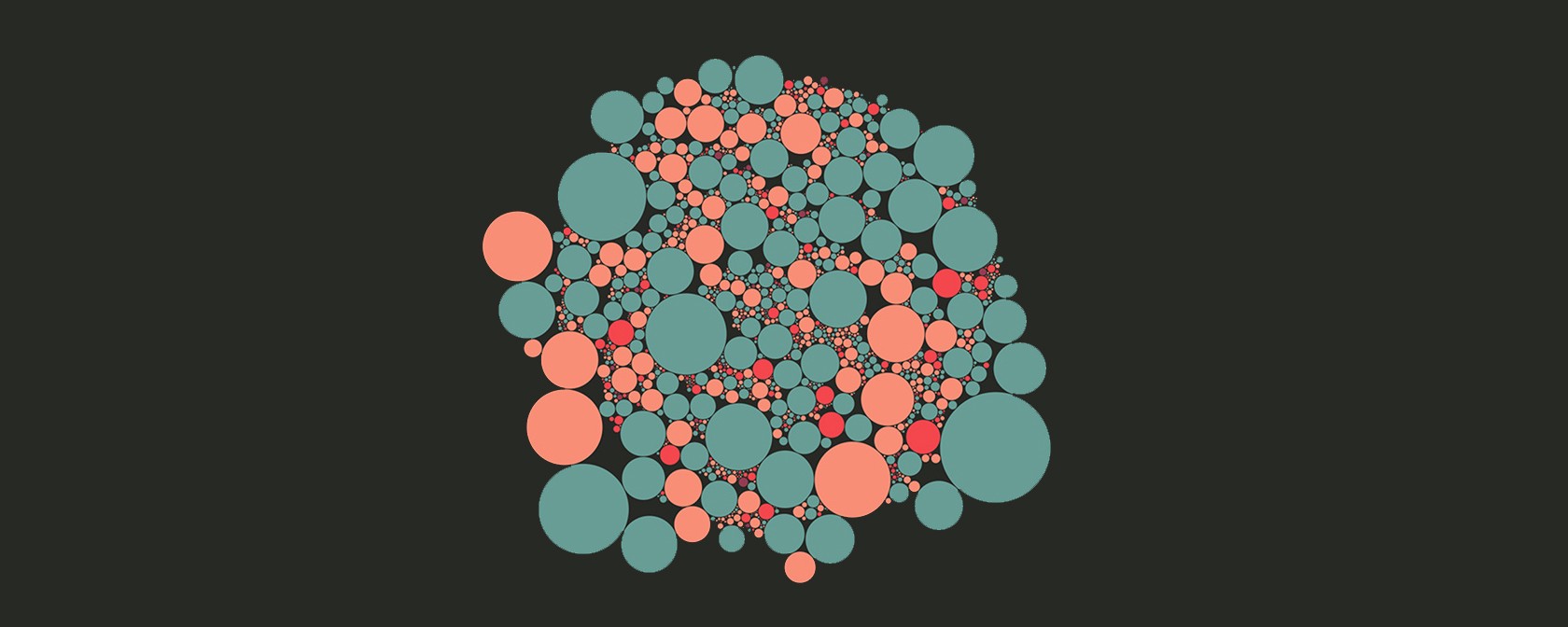
Today I want to talk about one of the trickier decisions we faced while making it. That decision was about tooltips–whether to show the reader what language each circle represented. This is something we wanted to do, but it had to be done in a way that was fair. Fair in this case meant two things: that tooltips would work equally well for both desktop and mobile users, and for both big dots and small dots.
Neglecting the first factor would mean that we were prioritizing one way of reading the essay over another. We very carefully designed the visualizations and page so they scale nicely to screen size, but if we’d created tooltips that didn’t work well on mobile screens then we’d be penalizing those users. Given that mobile devices are projected to account for 79 percent of internet use by the end of 2018, that wouldn’t be fair–especially as the bulk of those users will live in the developing world.
Neglecting the second factor would mean that we were prioritizing larger circles over smaller circles. This would mean drawing extra attention to languages spoken by more people over languages spoken by fewer (something that the decision to scale the circles by number of speakers already does, to some extent). Given that the whole point of the graphic is to draw attention to endangered languages, making it hard to find out more about the most endangered of those languages would have been self-defeating.
Ultimately, we couldn’t find a fair solution to both of those problems, so we made the decision to not feature tooltips at all on the circle layouts near the top. We figured that we could use these layouts to show the big picture, and then allow the reader to explore the data in detail using a combination of the “find my closest endangered language” feature, and the world map at the bottom. These features show the data in a much more equitable way–where each language is given the same-sized pin, with a full tooltip attached that works nicely on both mobile and desktop.
But that’s not quite the whole story, because you might have noticed that if you hover a mouse pointer over the circles in the top section for a moment then you do get a small HTML tooltip that tells you the state of the language. We left those in as an easter egg, intentionally not telling the reader they existed, so that mobile users didn’t feel like they were missing out on a feature that they wouldn’t be able to use.
Obfuscating a feature is obviously not a great solution, and it’s arguably a total betrayal of the principles I laid out above. But it was the best compromise we found between giving people information we knew they’d want, while not promising something we couldn’t deliver in a fair and equal manner. (I’ve also written in more detail about the design process for this interactive over on the blog of our publisher, Storythings.)
How We Get To Next was a magazine that explored the future of science, technology, and culture from 2014 to 2019. This article is part of our Histories of”¦ section, which looks at stories of innovation from the past. Click the logo to read more.