


On an ordinary day in December of 2014, a man died in a bumpy ambulance, en route to a nearby hospital in rural Nigeria.
This man, who was remarkable in many ways–the least of which because he was my uncle–passed away before the ambulance made it to the hospital. He died in transit, and because there was never a formal autopsy, the causes of his death were left unknown.
In this sense, he was not unique. Death is a messy reality–both the act itself as much as the process of identifying, tracing, and recording its causes. More than 151,000 people die each day around the world, and on that date in December, my uncle just happened to fall into the significant portion whose deaths are never completely certified.
Death is also a curiously geographic phenomenon, precisely because its cause and the location in which it takes place are often linked. Amidst the confusion and numbness of the aftermath of my uncle’s passing, I clung to the idea that his location in a rural area rather than his usual home of Lagos was to blame. I wanted to believe that he might have survived had he been somewhere else.
At that time, I was making the sort of frenzied accusations and bargains the mournful are prone to, but it is true that there is a connection between where we come from, where we live, and what we die from. Just as the places we live affect the circumstances of our lives, so too can they generate insights about those things likely to take our lives away.

The Global Burden of Disease Study (GBD), the world’s largest and most comprehensive description of global mortality patterns, confirms the link between death and geography through empirical comparisons of mortality data for each country in the world. Distributed by the World Health Organization and involving over 1,600 collaborators worldwide, it explains what is responsible for all of the deaths that happen globally.
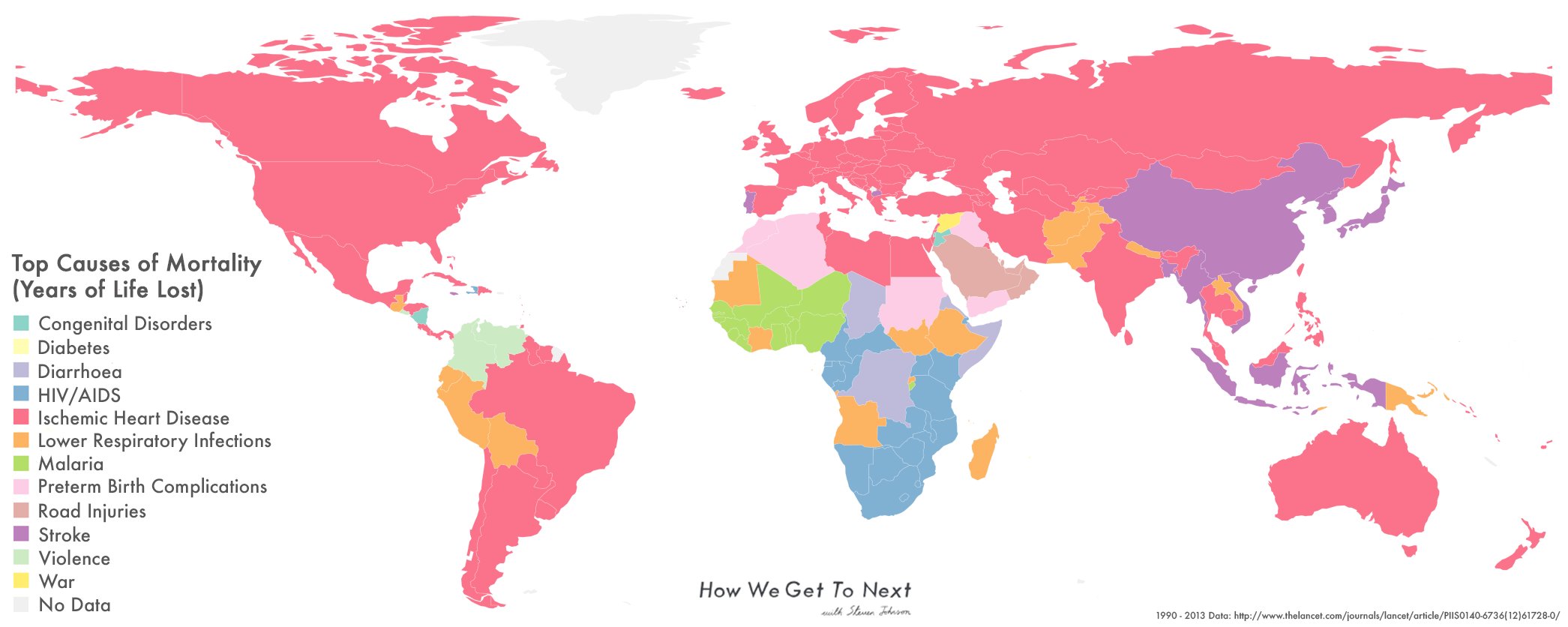
The most recent report from 2013 gives a succinct list of the top 10 causes of years of life lost around the world. They are, in order: ischemic heart diseases (when the heart is unable to get blood, which typically leads to heart attacks), lower respiratory infections (such as pneumonia and bronchitis), stroke, diarrhea, road injuries, HIV/AIDS, preterm birth complications, malaria, neonatal encephalopathy (severe brain injuries occurring within the first month of life), and congenital causes (conditions present from birth).
These top causes are not evenly distributed geographically. Many of the ones that are completely preventable and curable, like diarrhea and malaria, are centered in Western Africa. HIV/AIDS looms large in southern Sub-Saharan Africa. Cardiovascular issues like ischemic heart disease are the number one taker of lives in the majority of the world, but particularly in developed economies. Neonatal encephalopathy rates high on the list because almost half of all child deaths occurring under age 5 are among infants in their first 28 days of life. These deaths happen nearly universally in low- and middle-income countries.
Not all of the causes on the list are diseases. Road injuries, which include pedestrians, cyclists, and motorcyclists, are the leading cause of death among young people globally, but occur almost entirely in low- and middle-income countries (they rate as the top cause in a trifecta of nations in the Middle East). And in 2013, Syria was the only country with war listed as its number one cause of years of life lost.
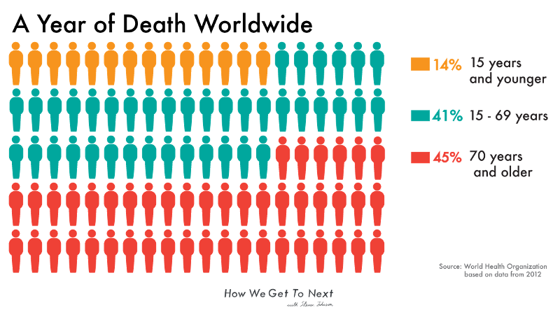
The term “years of life lost” is important. Unlike other reports, the GBD measures “causes of years of life lost” rather than “causes of number of deaths,” because comparing mortality numbers in different countries is a pointless task. A country with more people and older citizens will almost always have higher mortality numbers, simply because more of the old die than the young. Years of life lost rectifies this by focusing on premature mortality, so that the death of a child carries more weight than that of a 90-year-old. The measure is calculated from the number of deaths multiplied by a standard life expectancy at the age at which death occurs. (As we showed earlier this month, average global life expectancy today is 70.5 years). With years of life lost, emphasis shifts to what Alan Lopez–chair of Global Health and Burden of Disease Measurement at the University of Melbourne and one of the original creators of the first GBD report–calls “avoidable mortality.”
Built into the “years of life lost” measure is the idea that everyone, regardless of where they live, has the right to a certain number of years of life. The worldwide ability to live to a certain age automatically means the right to reach that age. But as the GBD data shows, this does not play out uniformly throughout the world.
The top causes of years of life lost for different countries imply a certain rhythm to the distribution of disease, and it’s easy to extrapolate reasons behind trends for which countries are disproportionately affected by which conditions. Mohsen Naghavi, researcher and contributor to the 2013 report, was careful to explain that population demographics account for many disease distributions: Countries with significant older populations will always have cardiovascular diseases as a top cause, while countries with younger populations will always rank higher with infectious diseases and injuries. A map of the top 10 causes of years of life lost is also a tangential study in population demographics.
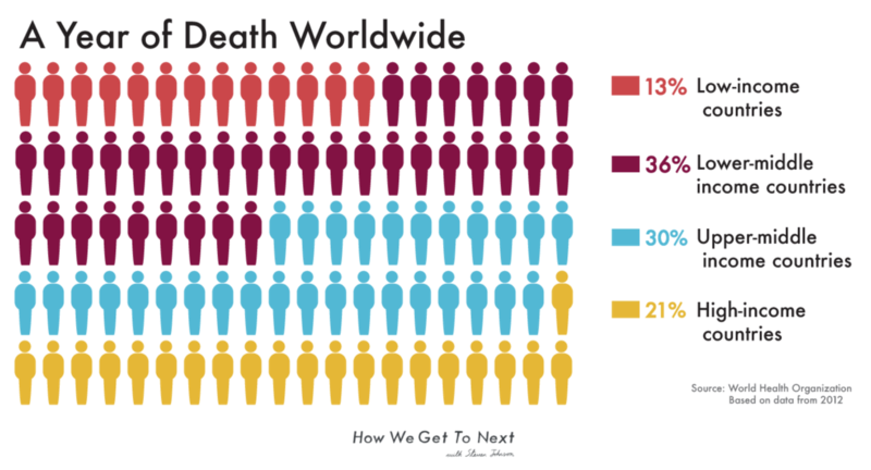
But this explanation doesn’t account for how people in developed countries simply don’t die from things like tuberculosis, or are at least far less likely to. And the report itself details, with sterile abstraction, facts impossible to dismiss as a result of mere population: “The probability of death in reproductive-age adults (exact age 15″”50) ranged from 1″”2 percent for women in Andorra to 52 percent for men in Lesotho,” a country in southern Africa. Meanwhile, “In high-income regions, the probability of death was generally twice as high for men as for women,” and “In some countries, such as Norway and the United States, drug and alcohol use disorders account for more than 8 percent of the total probability of dying in this age interval for either sex.” The more the data is disaggregated, the easier it is to see that we die as we live: differently and unequally.
So while at first glance the outcomes seem clear and intelligible, longer examination punctures that myth. The story, in reality, is complicated–but then so is death. Death is so messy and difficult to contend with emotionally that it makes sense we want our information about it to be simple. Clean infographics are comforting. There’s a slick satisfaction to seeing causes of deaths neatly encoded on colorful charts and maps. Like parts clicking into place, they cut a bland kind of sense, a resolution that the real world does not so easily give.

Lopez explained to me that despite the fact “data is something countries take quite seriously,” the issue of sorting through mortality statistics remains difficult for researchers. The report focuses on public data, and countries might not want to make their vital statistics data available. Even if they do, they may have differing codes for diseases, or try to fudge numbers. He cited a series of papers he completed with Lene Mikkelson, a researcher at the University of Queensland, about vital statistics worldwide, which highlight the grimness of the numbers. Out of the more than 56 million people that died in 2013, only around 20 million of those deaths were publicly available, which is to say had causes that researchers could verify and use in the report. Of that 20 million, about a quarter are assigned vague, unintelligible codes. This leaves only about 15 million deaths whose certification researchers have a high level of confidence about.
Researchers and statisticians have sound and sophisticated techniques for estimation in sites where they lack data. By using data from countries in similar regions, past numbers, and statistical modeling, they can extrapolate numbers from the gaps. But there’s a reason each GBD takes somewhere between 12 and 18 months to put out: The data, like death itself, resists easy categorization. What is classified as myocardial infarction (more commonly known as a heart attack) in Lebanon may not be the same as a myocardial infarction in Luxembourg. General misclassification is also an issue. A country might assign many deaths to a condition like senility, which the World Health Organization insists is an effect of aging rather than a cause of death. Problems of miscoding can produce garbage data, as happens in the instances where unspecified cancer is listed as a cause of death (cancer is only an acceptable form of death when the specific type is given).

This gargantuan effort of classifying the world’s deaths is done with the goal of ensuring that all who die are counted. Each year the task becomes more complicated (consider that when the GBD began in 1990, it only encoded 120 causes of death; today, there are more than 350). After death, many of us become figures in databases, records in offices, and bureaus of vital statistics. The GBD works to ensure that even those of us who slip away without a sound or trace are considered as well.

I still don’t know what killed my uncle. He had liver problems as a result of drinking too much (cirrhosis doesn’t crack Nigeria’s top 10 causes of years of life lost). He was also anemic, and a week before his passing, it seemed as though he might have caught a bad case of influenza (lower respiratory infections are number two on Nigeria’s list). Afterwards, there were murmurs of organ failure and heart complications (cardiovascular issues are the top global cause of death).
Recently, I spoke to my father about the confusion around my uncle’s death which persists to this day. He surprised me by saying that perhaps, if we had tried hard enough, we could have put the puzzle pieces together–but that to do so might have given us less than it took away. “Maybe it’s more useful to worry about being alive than it is to dwell on the details of his end,” my father said.
A new GBD report is slated for release later this year. Knowing that my uncle will be reflected in the millions of data points produces an odd feeling within me, something between resolution and dissonance. But the purpose of a report on mortality patterns is not to give comfort. It is to provide information that policymakers can use to improve public health. By equipping governments with data about what death looks like, the statistics provide that which death often does not: the ability to walk away with more answers than questions.

How We Get To Next was a magazine that explored the future of science, technology, and culture from 2014 to 2019. This article is part of our Vital Signs section, on the future of human health. Click the logo to read more.