
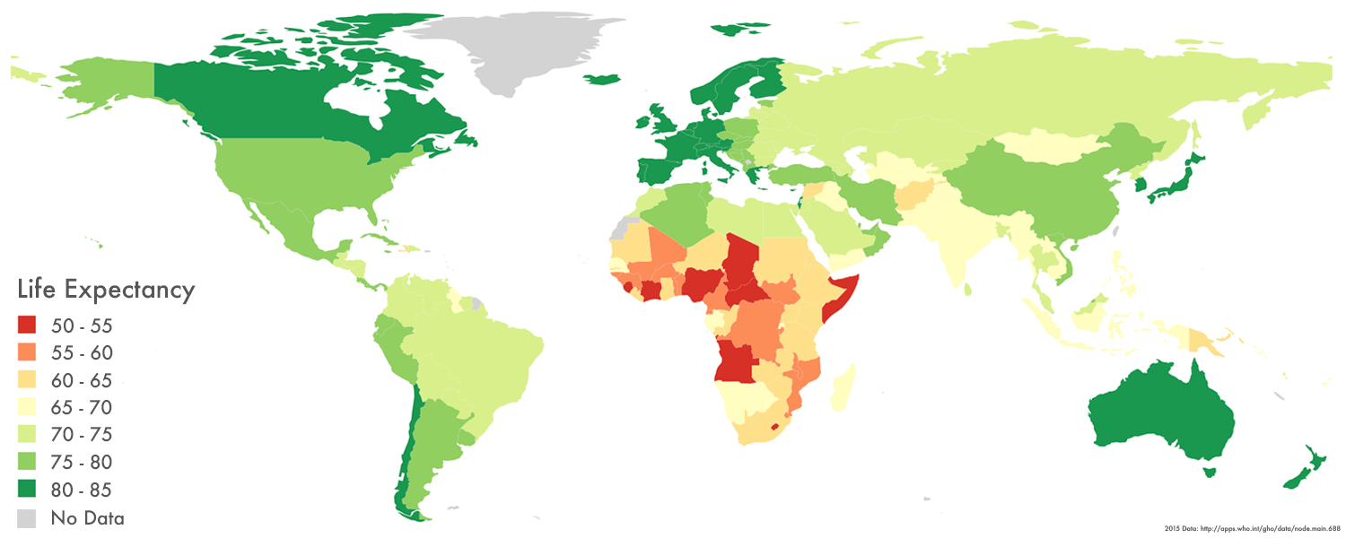

Average human life expectancy at birth is 70.5 years. If you were born between 2010 and 2015 in an average country, with an average life, then a little over seven decades is about what you can expect before you die.
But that single number tells us so little about the breadth of human experience. Some people live long lives. Others’ lives are cut short. In Japan, you’ll likely live to 83.7 years, while in Sierra Leone the figure is just 50.1 years. You can see the geographical distribution around the world in the map above.

Rising and Rising
Human lifespan has skyrocketed since we emerged as a species. In the Bronze and Iron Ages, life expectancy at birth is thought to have been about 26 years. In 1900, it had only risen to 31 years. But the spread of public health measures changed things, fast. By 1950, average life expectancy at birth had increased to 48 years. In 2010 it was 67.2 years. Who knows what it may reach in the future, and what the effects might be.
These rises aren’t equal across all countries, though. Here’s a mass of charts, showing how life expectancy changed between 1960 and 2009. Each line represents a country, and each box a continent.
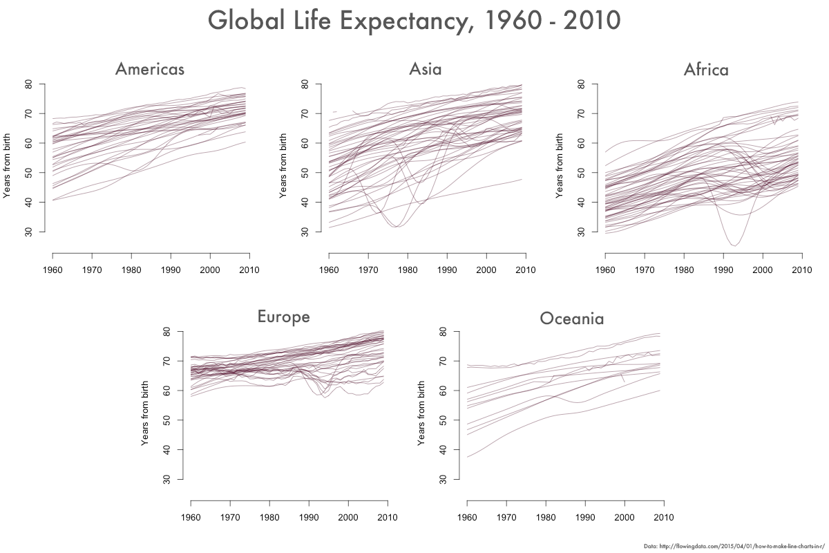
You can see how much variation there is from country to country, and it’s clear that the broad trend is upward. But the number of lines in each box makes it a little difficult to identify more detailed changes. Below is the same data separated by subregion instead of continent.
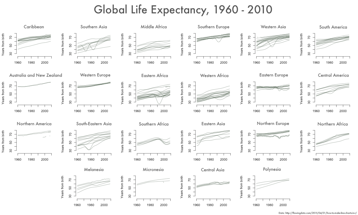
Here, you can see things a little more clearly. Wars and genocides show up as temporary dips: The line that nosedives in Eastern Africa in the early 1990s, for example, represents the Rwandan genocide that killed so many of the country’s minority Tutsi population. One of the significant dips in Southeastern Asia shows the effects of the brutal Khmer Rouge regime, in power in Cambodia from 1975 to 1979, and responsible for the early deaths of some two million people. In Western Asia, the Iran-Iraq War Iraq took its devastating toll on average life expectancy in Iraq, which fell from 61 in 1975 to 46 in 1983.
Alternatively, the burden of disease (particularly AIDS in Southern Africa) shows up in the data as more long-lasting depressions. In Northern Europe, the stark difference between the Baltic states of the former Soviet Union and their Western neighbors couldn’t be clearer even today, while other former Soviet states suffer from high rates of cardiovascular disease caused by dangerous levels of alcohol and tobacco consumption, rampant infectious diseases, and poor quality public health care.
Healthy life expectancy
Despite the impacts of the crises detailed above, it’s actually fairly difficult to slow the consistent rise of life expectancy rates around the world, and as a result, dramatic rises in such a short timespan are causing problems for many countries. The aging populations of developed countries are a “demographic time bomb,” says Szu Ping Chang, who wrote in The Telegraph in January 2016 that “advanced economies risk sleepwalking into a new reality of permanently lower growth and higher debt.”
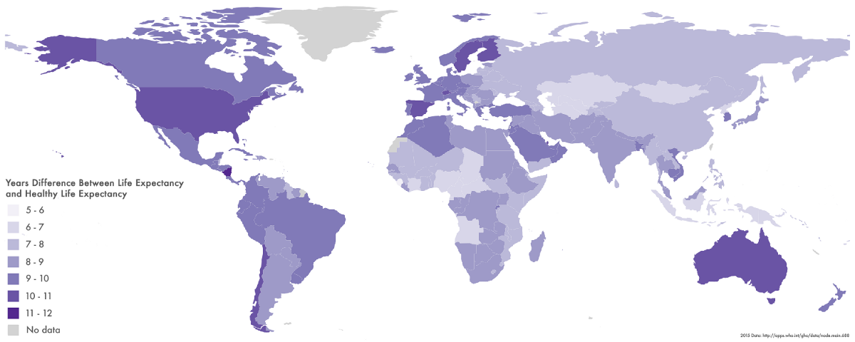
Advances in medicine are creating a new statistic that was barely considered before the 21st century: “healthy life expectancy,” or the number of years you can expect to live a healthy life without disease or disability. Here’s a map showing how much the two differ–the darker the country, the more “unhealthy” years a person endures before death. As you’d expect, they tend to be higher in richer countries. So according to the statistics, people in the United States, Spain, Sweden, and Finland can on average expect to live for more than a decade in poor health. In Sub-Saharan Africa, that figure is only five to six years.
Gender differences
But perhaps the most interesting aspect of life expectancy is the difference between women and men. You probably already know that women live longer on average, with lower mortality rates at every age. About 90 percent of individuals aged 110 are female. While once women in child-bearing age groups had a higher mortality rate than males, that’s no longer the case.
Why? There’s some debate. Historically, men have consumed more tobacco, drugs, and alcohol than women in most societies. Men are also more likely to die from injuries–be those accidental (car crashes or occupational accidents) or intentional (war or suicide). Some also argue that the difference is an application of a general rule seen in all mammal species where larger individuals tend to have shorter lives.
But whatever the cause, the difference is shrinking. The difference in life expectancy between men and women in the United States dropped from 7.8 years in 1979 to 5.3 years in 2005. Equality is clearly having some effect.
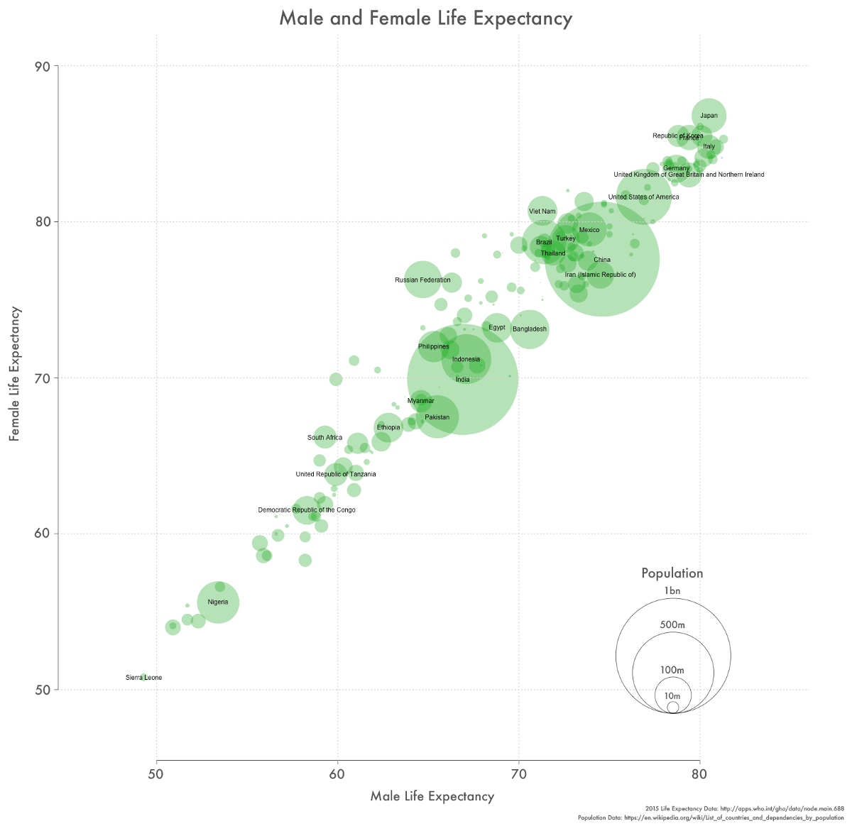
To cap things off, here’s a chart showing the difference between male and female life expectancy in every country in the world. Each circle represents a country, with the area of the circle proportional to its population.
How We Get To Next was a magazine that explored the future of science, technology, and culture from 2014 to 2019. This article is part of our Vital Signs section, on the future of human health. Click the logo to read more.