


As How We Get To Next’s editor for data journalism, I spend a lot of time looking at different statistics. Some of them are bad statistics, like GDP. But today I want to write about my favorite recent statistical discovery: the Disability-Adjusted Life Year, or DALY.
Historically, comparisons of the impact of different diseases were done by looking at casualty figures. But deaths are a blunt instrument; they don’t account for conditions that leave a person paralyzed or with a long-term disability. So you could look at people who are affected by a disease, but this puts the common cold on a par with ebola, skewing the figures towards conditions which simply spread widely.
So in 1990, when epidemiologists Christopher Murray and Alan Lopez were asked by the World Bank to study the burden that disease places on the world, they needed to come up with something better. A better statistic would balance both death and disability, weighting factors like duration of illness, severity of disability, distribution across a population and impact on normal life. The result was the beautiful, elegant DALY.
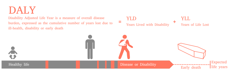
The DALY is simple, but flexible enough to adequately represent a range of different conditions. It’s comprised of two numbers added together–the first is years of life lost, which is calculated by multiplying the number of deaths caused by the disease by the standard life expectancy of a person not afflicted by the disease. This number reflects how deadly a disease is.
The second is years lost due to disability, which you get by multiplying together the number of cases, by the average duration of a single case in years, by a disability weighting function which represents how severe the disability is. The amputation of a single finger carries a disability weight of 0.03, while Alzheimers has a disability weight of 0.67. Once the multiplication is complete, this number reflects how disabling a disease is.
Some of you will already be picking holes in this, and Murray and Lopez acknowledged a series of value choices in their original formulation of the concept. The most obvious are the disability weightings, which in reality would vary from person to person and country to country, depending on each sufferer’s unique circumstances.
But there’s also the question of whether a year of healthy life in your 20s is equivalent to a year of healthy life in your 70s, whether a year of healthy life now is worth more to society than one gained at some point in the medium-term future, and whether all people are equal–whether a population loses the same amount of “health” through one person dying as another. The full details of their choices and the rationale behind them can be found in their report, “The Global Burden of Disease,” which was published in 1996.
But the concept has taken firm root in public health circles. It’s a key statistic that the World Health Organization uses in its National and Global Burden of Disease studies, and the World Bank in its World Development Reports. It’s used to measure everything from cigarette consumption or road injuries to depression or self-harm.

How We Get To Next was a magazine that explored the future of science, technology, and culture from 2014 to 2019. This article is part of our Vital Signs section, on the future of human health. Click the logo to read more.